「2026年のWebデザイントレンドを取り入れたいけど、実装方法がわからない・・・」そんな悩みを抱えていませんか?
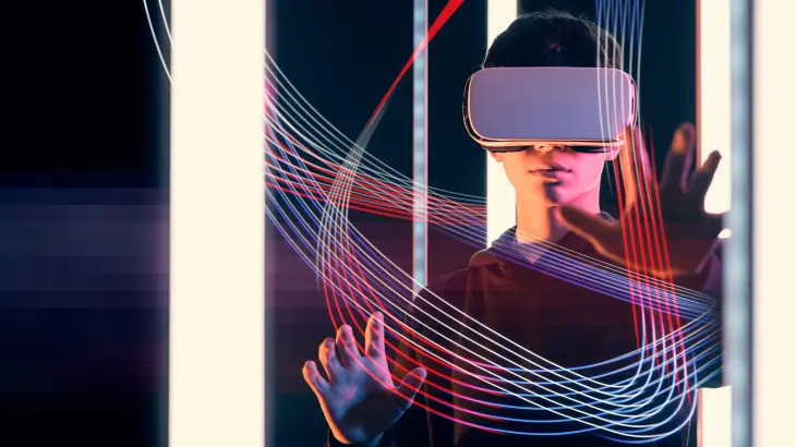
Webデザインの世界は日々進化しており、2026年は特にAI技術との融合や没入型体験を重視したデザインが主流となっています。しかし、トレンドを知っていても、実際にコードとして実装できなければ意味がありません。
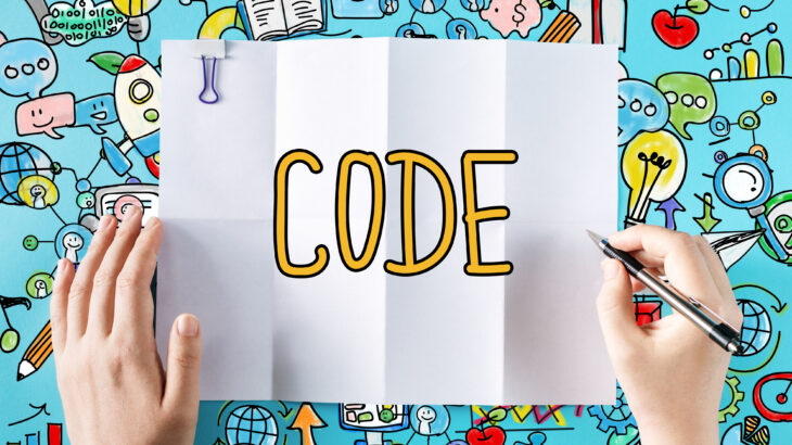
本記事では、2026年に流行しているWebデザイン7選を、そのままコピペで使えるソースコード付きで徹底解説します。HTML、CSS、JavaScriptの実装例を交えながら、初心者でも今日から使える実践的な内容をお届けします。
Web制作会社が、実際のプロジェクトで採用している最新テクニックを惜しみなく公開しますので、ぜひ最後までご覧ください。
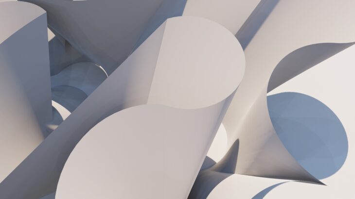
2026年Webデザイントレンドの全体像
2026年のデザイン潮流を理解する
2026年のWebデザインは、「体験価値の最大化」と「アクセシビリティの両立」がキーワードとなっています。
単に見た目が美しいだけでなく、ユーザーが直感的に操作でき、すべての人にとって使いやすいデザインが求められています。
■ 特に注目すべきは以下の3つの方向性です。
- 没入型インターフェース:3D要素やアニメーションを活用した体験設計
- AIパーソナライゼーション:ユーザーごとに最適化される動的デザイン
- サステナブルデザイン:軽量で環境負荷の少ないコード設計
トレンドを取り入れる際の注意点
注意:トレンドを闇雲に取り入れると、サイトの表示速度低下やユーザビリティの悪化を招く可能性があります。
■ デザイントレンドを実装する際は、必ず以下の点を確認しましょう。
- Core Web Vitalsへの影響を測定する
- モバイルファーストで設計する
- プログレッシブエンハンスメントを意識する
- アクセシビリティガイドライン(WCAG 2.2)に準拠する
本記事で紹介する7つのデザイン
■ これから紹介する7つのWebデザインは、いずれも2026年現在、多くの先進的なWebサイトで採用されているものです。
- ネオグラスモーフィズム
- AIドリブンマイクロインタラクション
- 3Dスクロールアニメーション
- ダイナミックカラーシステム
- ニューモーフィズム2.0
- インタラクティブグリッドレイアウト
- モーションタイポグラフィ
それぞれコピペ可能なソースコードとともに、実装のポイントを解説していきます。
ネオグラスモーフィズムの実装方法
ネオグラスモーフィズムとは
ネオグラスモーフィズムは、従来のグラスモーフィズムを進化させたデザイン手法です。
すりガラスのような透明感に加え、光の屈折や反射をよりリアルに表現することで、奥行きのある洗練されたUIを実現します。
2026年では、このデザインがカード型UIやモーダルウィンドウ、ナビゲーションメニューなど、幅広い場面で採用されています。
基本的なHTMLとCSS
■ まずは、ネオグラスモーフィズムの基本的な実装コードをご紹介します。
ネオグラスカード
2026年トレンドのガラス効果を適用したカードデザインです。
<!-- HTML -->
<div class="neo-glass-container">
  <div class="neo-glass-card">
    <div class="glass-content">
      <h3>ネオグラスカード</h3>
      <p>2026年トレンドのガラス効果を適用したカードデザインです。</p>
      <button class="glass-button">詳細を見る</button>
    </div>
  </div>
</div>/* CSS */
.neo-glass-container {
min-height: 400px;
background: linear-gradient(135deg, #667eea 0%, #764ba2 100%);
display: flex;
align-items: center;
justify-content: center;
padding: 40px;
}
.neo-glass-card {
background: rgba(255, 255, 255, 0.1);
backdrop-filter: blur(20px) saturate(180%);
-webkit-backdrop-filter: blur(20px) saturate(180%);
border-radius: 24px;
border: 1px solid rgba(255, 255, 255, 0.2);
box-shadow:
0 8px 32px rgba(0, 0, 0, 0.1),
inset 0 1px 0 rgba(255, 255, 255, 0.3),
inset 0 -1px 0 rgba(0, 0, 0, 0.1);
padding: 40px;
max-width: 400px;
position: relative;
overflow: hidden;
}
.neo-glass-card::before {
content: '';
position: absolute;
top: 0;
left: -50%;
width: 100%;
height: 100%;
background: linear-gradient(
90deg,
transparent,
rgba(255, 255, 255, 0.2),
transparent
);
transform: skewX(-15deg);
pointer-events: none;
}
.glass-content h3 {
color: #ffffff;
font-size: 24px;
margin-bottom: 16px;
font-weight: 700;
}
.glass-content p {
color: rgba(255, 255, 255, 0.9);
line-height: 1.8;
margin-bottom: 24px;
}
.glass-button {
background: rgba(255, 255, 255, 0.2);
backdrop-filter: blur(10px);
border: 1px solid rgba(255, 255, 255, 0.3);
border-radius: 12px;
color: #ffffff;
padding: 12px 24px;
font-size: 16px;
cursor: pointer;
transition: all 0.3s ease;
}
.glass-button:hover {
background: rgba(255, 255, 255, 0.3);
transform: translateY(-2px);
box-shadow: 0 4px 15px rgba(0, 0, 0, 0.2);
}実装時のポイントと注意事項
backdrop-filterプロパティは、一部の古いブラウザではサポートされていません。
そのため、フォールバックとして半透明の背景色を設定しておくことを推奨します。
/* フォールバック付きの実装 */
.neo-glass-card {
  /* フォールバック用の背景色 */
  background: rgba(102, 126, 234, 0.8);
}

@supports (backdrop-filter: blur(20px)) {
  .neo-glass-card {
    background: rgba(255, 255, 255, 0.1);
    backdrop-filter: blur(20px) saturate(180%);
  }
}
AIマイクロインタラクションの作成
AIドリブンなインタラクションとは
2026年のWebデザインでは、ユーザーの行動を予測し、最適なタイミングでフィードバックを返すAIドリブンなマイクロインタラクションが注目を集めています。
従来のホバーエフェクトやクリックアニメーションに加え、スクロール速度やマウスの動きのパターンを分析し、ユーザーごとにカスタマイズされたアニメーションを提供します。
スマートホバーエフェクトの実装
■ マウスの位置を追跡し、動的に反応するインタラクティブなカードの実装例です。
スマートカード
マウスの動きに追従する光のエフェクト
<!-- HTML -->
<div class="smart-card-container">
  <div class="smart-card" id="smartCard">
    <div class="card-glow"></div>
    <div class="card-inner">
      <span class="card-icon">✨</span>
      <h3>スマートカード</h3>
      <p>マウスの動きに追従する光のエフェクト</p>
    </div>
  </div>
</div>/* CSS */
.smart-card-container {
display: flex;
justify-content: center;
padding: 60px;
background: #0a0a0a;
}
.smart-card {
position: relative;
width: 350px;
height: 250px;
background: linear-gradient(135deg, #1a1a2e 0%, #16213e 100%);
border-radius: 20px;
overflow: hidden;
cursor: pointer;
transition: transform 0.1s ease;
}
.card-glow {
position: absolute;
width: 200px;
height: 200px;
background: radial-gradient(
circle,
rgba(99, 102, 241, 0.6) 0%,
transparent 70%
);
border-radius: 50%;
pointer-events: none;
opacity: 0;
transition: opacity 0.3s ease;
transform: translate(-50%, -50%);
}
.smart-card:hover .card-glow {
opacity: 1;
}
.card-inner {
position: relative;
z-index: 1;
padding: 40px;
height: 100%;
display: flex;
flex-direction: column;
justify-content: center;
border: 1px solid rgba(255, 255, 255, 0.1);
border-radius: 20px;
}
.card-icon {
font-size: 40px;
margin-bottom: 16px;
}
.card-inner h3 {
color: #ffffff;
font-size: 22px;
margin-bottom: 12px;
}
.card-inner p {
color: rgba(255, 255, 255, 0.7);
font-size: 14px;
}// JavaScript
document.addEventListener('DOMContentLoaded', () => {
const card = document.getElementById('smartCard');
const glow = card.querySelector('.card-glow');
// マウス追従エフェクト
card.addEventListener('mousemove', (e) => {
const rect = card.getBoundingClientRect();
const x = e.clientX - rect.left;
const y = e.clientY - rect.top;
// グロー位置の更新
glow.style.left = `${x}px`;
glow.style.top = `${y}px`;
// 3D傾斜効果
const centerX = rect.width / 2;
const centerY = rect.height / 2;
const rotateX = (y - centerY) / 10;
const rotateY = (centerX - x) / 10;
card.style.transform = `
perspective(1000px) rotateX(${rotateX}deg) rotateY(${rotateY}deg) scale3d(1.02, 1.02, 1.02)`;
});
// マウスリーブ時のリセット
card.addEventListener('mouseleave', () => {
card.style.transform = 'perspective(1000px) rotateX(0) rotateY(0) scale3d(1, 1, 1)';
});
});パフォーマンス最適化のコツ
■ マイクロインタラクションは視覚的な魅力を高める一方で、パフォーマンスへの影響も考慮する必要があります。
以下のポイントを意識しましょう。
transformとopacityのみでアニメーションを実現(レイアウトの再計算を避ける)will-changeプロパティで最適化ヒントをブラウザに伝えるrequestAnimationFrameを使用してフレームレートを安定させる- デバウスやスロットリングで不要な処理を削減する
3Dスクロールアニメーションの実装
没入感を生む3Dスクロール体験
2026年のWebサイトでは、スクロールに連動した3Dアニメーションによる没入型体験が主流となっています。
ユーザーがページをスクロールするたびに、コンテンツが立体的に動き出すことで、ストーリーテリング効果を高めます。
Intersection Observer APIを使った実装
■ 軽量かつ効率的な3Dスクロールアニメーションの実装例です。
Feature 01
スクロールで3Dアニメーションが発動します
Feature 02
回転しながら登場するエフェクト
Feature 03
奥から手前に飛び出すエフェクト
<!-- HTML -->
<section class="scroll-section">
  <div class="scroll-item" data-animation="fade-up-3d">
    <div class="item-content">
      <h3>Feature 01</h3>
      <p>スクロールで3Dアニメーションが発動します</p>
    </div>
  </div>
  <div class="scroll-item" data-animation="rotate-in">
    <div class="item-content">
      <h3>Feature 02</h3>
      <p>回転しながら登場するエフェクト</p>
    </div>
  </div>
  <div class="scroll-item" data-animation="scale-up">
    <div class="item-content">
      <h3>Feature 03</h3>
      <p>奥から手前に飛び出すエフェクト</p>
    </div>
  </div>
</section>/* CSS */
.scroll-section {
padding: 50px 20px;
background: linear-gradient(180deg, #0f0f23 0%, #1a1a3e 100%);
min-height: 100vh;
}
.scroll-item {
max-width: 600px;
margin: 50px auto 0;
opacity: 0;
transition: all 0.8s cubic-bezier(0.4, 0, 0.2, 1);
}
/* フェードアップ3D */
.scroll-item[data-animation="fade-up-3d"] {
transform: perspective(1000px) translateY(100px) rotateX(10deg);
}
.scroll-item[data-animation="fade-up-3d"].is-visible {
opacity: 1;
transform: perspective(1000px) translateY(0) rotateX(0);
}
/* 回転イン */
.scroll-item[data-animation="rotate-in"] {
transform: perspective(1000px) rotateY(-30deg) translateX(-100px);
}
.scroll-item[data-animation="rotate-in"].is-visible {
opacity: 1;
transform: perspective(1000px) rotateY(0) translateX(0);
}
/* スケールアップ */
.scroll-item[data-animation="scale-up"] {
transform: perspective(1000px) translateZ(-200px) scale(0.8);
}
.scroll-item[data-animation="scale-up"].is-visible {
opacity: 1;
transform: perspective(1000px) translateZ(0) scale(1);
}
.item-content {
background: rgba(255, 255, 255, 0.05);
backdrop-filter: blur(10px);
border: 1px solid rgba(255, 255, 255, 0.1);
border-radius: 24px;
padding: 48px;
}
.item-content h3 {
color: #ffffff;
font-size: 28px;
margin-bottom: 16px;
}
.item-content p {
color: rgba(255, 255, 255, 0.7);
font-size: 16px;
line-height: 1.8;
}// JavaScript - Intersection Observer API
document.addEventListener('DOMContentLoaded', () => {
const observerOptions = {
root: null,
rootMargin: '0px 0px -100px 0px',
threshold: 0.1
};
const observer = new IntersectionObserver((entries) => {
entries.forEach(entry => {
if (entry.isIntersecting) {
entry.target.classList.add('is-visible');
// 一度表示したら監視を解除(パフォーマンス向上)
observer.unobserve(entry.target);
}
});
}, observerOptions);
// すべてのスクロールアイテムを監視
document.querySelectorAll('.scroll-item').forEach(item => {
observer.observe(item);
});
});スクロール連動パララックスの追加
■ さらに高度な演出として、スクロール量に応じて連続的に変化するパララックス効果を追加できます。
// 高度なパララックス効果
class ParallaxController {
  constructor() {
    this.items = document.querySelectorAll('[data-parallax]');
    this.init();
  }

  init() {
    window.addEventListener('scroll', () => {
      requestAnimationFrame(() => this.update());
    });
  }

  update() {
    const scrollY = window.pageYOffset;

    this.items.forEach(item => {
      const speed = parseFloat(item.dataset.parallax) || 0.5;
      const rect = item.getBoundingClientRect();
      const centerY = rect.top + rect.height / 2;
      const viewportCenter = window.innerHeight / 2;
      const distance = centerY - viewportCenter;

      const translateY = distance * speed * -1;
      item.style.transform = `translateY(${translateY}px)`;
    });
  }
}

// 初期化
new ParallaxController();
ダイナミックカラーシステムの構築
CSS変数を活用した動的カラー管理
2026年のWebデザインでは、ダークモード対応やユーザーの好みに応じた動的なカラー変更が標準となっています。
CSS変数(カスタムプロパティ)を使うことで、効率的なカラーシステムを構築できます。
/* CSS - ダイナミックカラーシステム */
:root {
  /* プライマリカラー(HSL形式で管理)*/
  --hue-primary: 250;
  --saturation-primary: 90%;
  --lightness-primary: 60%;

  /* カラートークン */
  --color-primary: hsl(
    var(--hue-primary),
    var(--saturation-primary),
    var(--lightness-primary)
  );
  --color-primary-light: hsl(
    var(--hue-primary),
    var(--saturation-primary),
    80%
  );
  --color-primary-dark: hsl(
    var(--hue-primary),
    var(--saturation-primary),
    40%
  );

  /* 背景とテキスト */
  --color-bg: #ffffff;
  --color-bg-secondary: #f8f9fa;
  --color-text: #1a1a2e;
  --color-text-secondary: #6c757d;

  /* シャドウ */
  --shadow-sm: 0 2px 4px rgba(0, 0, 0, 0.05);
  --shadow-md: 0 4px 12px rgba(0, 0, 0, 0.1);
  --shadow-lg: 0 8px 24px rgba(0, 0, 0, 0.15);
}

/* ダークモード */
[data-theme="dark"] {
  --color-bg: #0f0f23;
  --color-bg-secondary: #1a1a3e;
  --color-text: #ffffff;
  --color-text-secondary: #a0a0a0;

  --shadow-sm: 0 2px 4px rgba(0, 0, 0, 0.3);
  --shadow-md: 0 4px 12px rgba(0, 0, 0, 0.4);
  --shadow-lg: 0 8px 24px rgba(0, 0, 0, 0.5);
}

/* システム設定に連動 */
@media (prefers-color-scheme: dark) {
  :root:not([data-theme="light"]) {
    --color-bg: #0f0f23;
    --color-bg-secondary: #1a1a3e;
    --color-text: #ffffff;
    --color-text-secondary: #a0a0a0;
  }
}
テーマ切り替え機能の実装
<!-- HTML -->
<div class="theme-switcher">
  <button class="theme-btn" data-theme="light" aria-label="ライトモード">
    <span class="theme-icon">☀️</span>
  </button>
  <button class="theme-btn" data-theme="dark" aria-label="ダークモード">
    <span class="theme-icon">🌙</span>
  </button>
  <button class="theme-btn" data-theme="auto" aria-label="システム設定に従う">
    <span class="theme-icon">💻</span>
  </button>
</div>

<div class="color-picker">
  <label>アクセントカラー:</label>
  <input type="range" id="hueSlider" min="0" max="360" value="250">
  <div class="color-preview" id="colorPreview"></div>
</div>/* テーマスイッチャーのスタイル */
.theme-switcher {
display: flex;
gap: 8px;
padding: 24px;
background: var(--color-bg-secondary);
}
.theme-btn {
width: 48px;
height: 48px;
border: none;
background: transparent;
border-radius: 12px;
cursor: pointer;
transition: all 0.3s ease;
}
.theme-btn:hover {
background: var(--color-primary-light);
}
.theme-btn.active {
background: var(--color-primary);
}
.theme-icon {
font-size: 20px;
}
.color-picker {
display: flex;
align-items: center;
gap: 16px;
background: var(--color-bg-secondary);
padding: 0 24px 24px;
}
.color-picker label {
color: var(--color-text);
font-weight: 500;
}
#hueSlider {
width: 200px;
height: 8px;
-webkit-appearance: none;
background: linear-gradient(
to right,
hsl(0, 90%, 60%),
hsl(60, 90%, 60%),
hsl(120, 90%, 60%),
hsl(180, 90%, 60%),
hsl(240, 90%, 60%),
hsl(300, 90%, 60%),
hsl(360, 90%, 60%)
);
border-radius: 4px;
cursor: pointer;
}
.color-preview {
width: 40px;
height: 40px;
border-radius: 50%;
background: var(--color-primary);
box-shadow: var(--shadow-md);
}// JavaScript - テーマ管理
class ThemeManager {
constructor() {
this.init();
}
init() {
// 保存されたテーマを適用
const savedTheme = localStorage.getItem('theme');
if (savedTheme && savedTheme !== 'auto') {
document.documentElement.setAttribute('data-theme', savedTheme);
}
// 保存されたカラーを適用
const savedHue = localStorage.getItem('primaryHue');
if (savedHue) {
this.updatePrimaryColor(savedHue);
}
this.bindEvents();
}
bindEvents() {
// テーマボタン
document.querySelectorAll('.theme-btn').forEach(btn => {
btn.addEventListener('click', () => {
const theme = btn.dataset.theme;
this.setTheme(theme);
this.updateActiveButton(btn);
});
});
// カラースライダー
const hueSlider = document.getElementById('hueSlider');
if (hueSlider) {
hueSlider.addEventListener('input', (e) => {
this.updatePrimaryColor(e.target.value);
localStorage.setItem('primaryHue', e.target.value);
});
}
}
setTheme(theme) {
if (theme === 'auto') {
document.documentElement.removeAttribute('data-theme');
} else {
document.documentElement.setAttribute('data-theme', theme);
}
localStorage.setItem('theme', theme);
}
updatePrimaryColor(hue) {
document.documentElement.style.setProperty('--hue-primary', hue);
}
updateActiveButton(activeBtn) {
document.querySelectorAll('.theme-btn').forEach(btn => {
btn.classList.remove('active');
});
activeBtn.classList.add('active');
}
}
// 初期化
new ThemeManager();ニューモーフィズム2.0のデザイン
進化したニューモーフィズムとは
ニューモーフィズム2.0は、2020年頃に流行した初代ニューモーフィズムの問題点を解消した進化版です。
コントラスト比を改善し、アクセシビリティを確保しながらも、柔らかな立体感を演出できるようになっています。
注意:初代ニューモーフィズムはコントラスト不足でアクセシビリティに問題がありました。
2.0では必ずWCAG基準を満たすコントラスト比を確保しましょう。
アクセシブルなニューモーフィズムボタン
System Status
75% Complete
<!-- HTML -->
<div class="neumorphism-container">
  <button class="neu-button">
    <span class="neu-icon">🚀</span>
    <span class="neu-text">Launch</span>
  </button>

  <div class="neu-card">
    <div class="neu-card-header">
      <span class="status-indicator active"></span>
      <h4>System Status</h4>
    </div>
    <div class="neu-progress-container">
      <div class="neu-progress-bar" style="--progress: 75%"></div>
    </div>
    <p class="neu-stats">75% Complete</p>
  </div>

  <div class="neu-toggle-group">
    <input type="checkbox" id="neuToggle" class="neu-toggle-input">
    <label for="neuToggle" class="neu-toggle"></label>
  </div>
</div>/* CSS - ニューモーフィズム2.0 */
.neumorphism-container {
padding: 60px;
background: #e8eef3;
min-height: 100vh;
display: flex;
flex-direction: column;
align-items: center;
gap: 40px;
}
/* ニューモーフィズムボタン */
.neu-button {
display: flex;
align-items: center;
gap: 12px;
padding: 20px 40px;
background: #e8eef3;
border: none;
border-radius: 16px;
cursor: pointer;
box-shadow:
8px 8px 16px #c5ccd3,
-8px -8px 16px #ffffff;
transition: all 0.2s ease;
}
.neu-button:hover {
box-shadow:
4px 4px 8px #c5ccd3,
-4px -4px 8px #ffffff;
}
.neu-button:active {
box-shadow:
inset 4px 4px 8px #c5ccd3,
inset -4px -4px 8px #ffffff;
}
.neu-icon {
font-size: 24px;
}
.neu-text {
font-size: 18px;
font-weight: 600;
color: #2d3748; /* コントラスト比4.5:1以上を確保 */
}
/* ニューモーフィズムカード */
.neu-card {
width: 300px;
padding: 32px;
background: #e8eef3;
border-radius: 24px;
box-shadow:
12px 12px 24px #c5ccd3,
-12px -12px 24px #ffffff;
}
.neu-card-header {
display: flex;
align-items: center;
gap: 12px;
margin-bottom: 24px;
}
.status-indicator {
width: 12px;
height: 12px;
border-radius: 50%;
background: #cbd5e0;
}
.status-indicator.active {
background: #48bb78;
box-shadow: 0 0 8px rgba(72, 187, 120, 0.5);
}
.neu-card-header h4 {
color: #2d3748;
font-size: 18px;
margin: 0;
}
/* プログレスバー */
.neu-progress-container {
height: 12px;
background: #e8eef3;
border-radius: 6px;
box-shadow:
inset 4px 4px 8px #c5ccd3,
inset -4px -4px 8px #ffffff;
overflow: hidden;
margin-bottom: 16px;
}
.neu-progress-bar {
height: 100%;
width: var(--progress);
background: linear-gradient(135deg, #667eea 0%, #764ba2 100%);
border-radius: 6px;
transition: width 0.5s ease;
}
.neu-stats {
color: #4a5568;
font-size: 14px;
text-align: center;
margin: 0;
}
/* トグルスイッチ */
.neu-toggle-input {
display: none;
}
.neu-toggle {
display: block;
width: 80px;
height: 40px;
background: #e8eef3;
border-radius: 20px;
box-shadow:
inset 4px 4px 8px #c5ccd3,
inset -4px -4px 8px #ffffff;
cursor: pointer;
position: relative;
transition: all 0.3s ease;
}
.neu-toggle::after {
content: '';
position: absolute;
top: 4px;
left: 4px;
width: 32px;
height: 32px;
background: #e8eef3;
border-radius: 50%;
box-shadow:
4px 4px 8px #c5ccd3,
-4px -4px 8px #ffffff;
transition: all 0.3s ease;
}
.neu-toggle-input:checked + .neu-toggle::after {
left: 44px;
background: linear-gradient(135deg, #667eea 0%, #764ba2 100%);
}ダークモード対応のニューモーフィズム
■ ニューモーフィズム2.0では、ダークモードにも対応した設計が重要です。
/* ダークモード対応 */
@media (prefers-color-scheme: dark) {
  .neumorphism-container {
    background: #1a1a2e;
  }

  .neu-button,
  .neu-card {
    background: #1a1a2e;
    box-shadow:
      8px 8px 16px #0f0f1a,
      -8px -8px 16px #252542;
  }

  .neu-button:hover {
    box-shadow:
      4px 4px 8px #0f0f1a,
      -4px -4px 8px #252542;
  }

  .neu-text,
  .neu-card-header h4 {
    color: #e2e8f0;
  }

  .neu-stats {
    color: #a0aec0;
  }
}
インタラクティブグリッドの作成方法
CSS Gridを活用した動的レイアウト
2026年では、ユーザーのインタラクションに応じて変化するインタラクティブグリッドレイアウトが多くのポートフォリオサイトやギャラリーサイトで採用されています。
<!-- HTML -->
<div class="interactive-grid">
  <div class="grid-item" data-size="large">
    <div class="item-overlay">
      <h3>Project 01</h3>
      <p>Web Application</p>
    </div>
    <img src="https://nextage-tech.com/blog/wp-content/uploads/2026/01/project-01.png" alt="Project 1">
  </div>
  <div class="grid-item" data-size="small">
    <div class="item-overlay">
      <h3>Project 02</h3>
      <p>Mobile App</p>
    </div>
    <img src="https://nextage-tech.com/blog/wp-content/uploads/2026/01/project-02.png" alt="Project 2">
  </div>
  <div class="grid-item" data-size="medium">
    <div class="item-overlay">
      <h3>Project 03</h3>
      <p>Branding</p>
    </div>
    <img src="https://nextage-tech.com/blog/wp-content/uploads/2026/01/project-03.png" alt="Project 3">
  </div>
  <div class="grid-item" data-size="small">
    <div class="item-overlay">
      <h3>Project 04</h3>
      <p>UI Design</p>
    </div>
    <img src="https://nextage-tech.com/blog/wp-content/uploads/2026/01/project-04.png" alt="Project 4">
  </div>
  <div class="grid-item" data-size="medium">
    <div class="item-overlay">
      <h3>Project 05</h3>
      <p>E-Commerce</p>
    </div>
    <img src="https://nextage-tech.com/blog/wp-content/uploads/2026/01/project-05.png" alt="Project 5">
  </div>
</div>/* CSS - インタラクティブグリッド */
.interactive-grid {
display: grid;
grid-template-columns: repeat(4, 1fr);
grid-auto-rows: 200px;
gap: 16px;
padding: 40px;
background: #0a0a0a;
}
.grid-item {
position: relative;
overflow: hidden;
border-radius: 16px;
cursor: pointer;
transition: all 0.5s cubic-bezier(0.4, 0, 0.2, 1);
}
/* サイズバリエーション */
.grid-item[data-size="large"] {
grid-column: span 2;
grid-row: span 2;
}
.grid-item[data-size="medium"] {
grid-column: span 2;
grid-row: span 1;
}
.grid-item[data-size="small"] {
grid-column: span 1;
grid-row: span 1;
}
.grid-item img {
width: 100%;
height: 100%;
object-fit: cover;
transition: transform 0.5s ease;
}
.item-overlay {
position: absolute;
inset: 0;
background: linear-gradient(
to top,
rgba(0, 0, 0, 0.8) 0%,
transparent 100%
);
display: flex;
flex-direction: column;
justify-content: flex-end;
padding: 24px;
opacity: 0;
transition: opacity 0.3s ease;
}
.grid-item:hover .item-overlay {
opacity: 1;
}
.grid-item:hover img {
transform: scale(1.1);
}
.item-overlay h3 {
color: #ffffff;
font-size: 20px;
margin: 0 0 8px 0;
transform: translateY(20px);
transition: transform 0.3s ease 0.1s;
}
.item-overlay p {
color: rgba(255, 255, 255, 0.7);
font-size: 14px;
margin: 0;
transform: translateY(20px);
transition: transform 0.3s ease 0.15s;
}
.grid-item:hover .item-overlay h3,
.grid-item:hover .item-overlay p {
transform: translateY(0);
}
/* ホバー時にグリッドを拡張 */
.grid-item.expanded {
grid-column: span 2 !important;
grid-row: span 2 !important;
z-index: 10;
}
/* レスポンシブ対応 */
@media (max-width: 1024px) {
.interactive-grid {
grid-template-columns: repeat(2, 1fr);
}
.grid-item[data-size="large"],
.grid-item[data-size="medium"] {
grid-column: span 2;
}
}
@media (max-width: 640px) {
.interactive-grid {
grid-template-columns: 1fr;
}
.grid-item[data-size="large"],
.grid-item[data-size="medium"],
.grid-item[data-size="small"] {
grid-column: span 1;
grid-row: span 1;
}
}// JavaScript - グリッドインタラクション
document.addEventListener('DOMContentLoaded', () => {
const gridItems = document.querySelectorAll('.grid-item');
gridItems.forEach(item => {
// クリックで拡張
item.addEventListener('click', () => {
// 他のアイテムの拡張を解除
gridItems.forEach(i => i.classList.remove('expanded'));
// クリックされたアイテムを拡張
item.classList.toggle('expanded');
});
});
// グリッド外クリックで拡張解除
document.addEventListener('click', (e) => {
if (!e.target.closest('.grid-item')) {
gridItems.forEach(i => i.classList.remove('expanded'));
}
});
});マソンリーレイアウトの実装
■ Pinterest風のマソンリーレイアウトもCSS Gridで実現できます。
/* マソンリーレイアウト */
.masonry-grid {
  display: grid;
  grid-template-columns: repeat(auto-fill, minmax(280px, 1fr));
  grid-auto-rows: 10px;
  gap: 16px;
}

.masonry-item {
  /* JavaScriptでgrid-row-endを動的に設定 */
}// マソンリーレイアウトの高さ計算
function resizeMasonryItem(item) {
const grid = document.querySelector('.masonry-grid');
const rowGap = parseInt(
window.getComputedStyle(grid).getPropertyValue('grid-row-gap')
);
const rowHeight = parseInt(
window.getComputedStyle(grid).getPropertyValue('grid-auto-rows')
);
const rowSpan = Math.ceil(
(item.querySelector('.masonry-content').getBoundingClientRect().height + rowGap) / (rowHeight + rowGap)
);
item.style.gridRowEnd = `span ${rowSpan}`;
}
// すべてのアイテムに適用
document.querySelectorAll('.masonry-item').forEach(item => {
resizeMasonryItem(item);
});
// リサイズ時に再計算
window.addEventListener('resize', () => {
document.querySelectorAll('.masonry-item').forEach(item => {
resizeMasonryItem(item);
});
});モーションタイポグラフィの実装
テキストアニメーションの基本
2026年のWebデザインでは、静的なテキストではなく、動きのあるタイポグラフィでユーザーの注目を集める手法が広く使われています。
ヒーローセクションやキャッチコピーに特に効果的です。
Creative Design Studio
<!-- HTML -->
<section class="hero-typography">
  <h1 class="split-text" data-animation="wave">
    Creative Design Studio
  </h1>
  <p class="typewriter" data-text="We create digital experiences that inspire."></p>
  <div class="scroll-indicator">
    <span class="scroll-text">Scroll Down</span>
    <span class="scroll-arrow">↓</span>
  </div>
</section>/* CSS - モーションタイポグラフィ */
.hero-typography {
min-height: 100vh;
display: flex;
flex-direction: column;
align-items: center;
justify-content: center;
background: linear-gradient(135deg, #1a1a2e 0%, #16213e 100%);
padding: 40px;
text-align: center;
}
/* 波打つテキスト */
.split-text {
font-size: clamp(32px, 8vw, 80px);
font-weight: 800;
color: #ffffff;
margin-bottom: 32px;
display: flex;
flex-wrap: wrap;
justify-content: center;
gap: 0 16px;
}
.split-text .char {
display: inline-block;
animation: wave 2s ease-in-out infinite;
animation-delay: calc(var(--char-index) * 0.05s);
}
@keyframes wave {
0%, 100% {
transform: translateY(0);
}
50% {
transform: translateY(-20px);
}
}
/* タイプライターエフェクト */
.typewriter {
font-size: clamp(18px, 3vw, 24px);
color: rgba(255, 255, 255, 0.8);
min-height: 36px;
position: relative;
}
.typewriter::after {
content: '|';
position: absolute;
right: -8px;
animation: blink 0.8s infinite;
}
@keyframes blink {
0%, 50% {
opacity: 1;
}
51%, 100% {
opacity: 0;
}
}
/* スクロールインジケーター */
.scroll-indicator {
position: absolute;
bottom: 40px;
display: flex;
flex-direction: column;
align-items: center;
gap: 8px;
}
.scroll-text {
color: rgba(255, 255, 255, 0.6);
font-size: 12px;
letter-spacing: 2px;
text-transform: uppercase;
}
.scroll-arrow {
color: rgba(255, 255, 255, 0.6);
font-size: 20px;
animation: bounce 2s infinite;
}
@keyframes bounce {
0%, 20%, 50%, 80%, 100% {
transform: translateY(0);
}
40% {
transform: translateY(10px);
}
60% {
transform: translateY(5px);
}
}// JavaScript - テキストアニメーション
document.addEventListener('DOMContentLoaded', () => {
// テキストを文字単位で分割
function splitTextToChars(element) {
const text = element.textContent;
element.textContent = '';
const words = text.split(' ');
words.forEach((word, wordIndex) => {
const wordSpan = document.createElement('span');
wordSpan.className = 'word';
for (let i = 0; i < word.length; i++) {
const charSpan = document.createElement('span');
charSpan.className = 'char';
charSpan.textContent = word[i];
charSpan.style.setProperty('--char-index', wordIndex * 10 + i);
wordSpan.appendChild(charSpan);
}
element.appendChild(wordSpan);
if (words.length - 1 > wordIndex) {
element.appendChild(document.createTextNode(' '));
}
});
}
// タイプライター効果
function typeWriter(element) {
const text = element.dataset.text || element.textContent;
const speed = parseInt(element.dataset.speed) || 100;
let index = 0;
element.textContent = '';
function type() {
if (text.length > index) {
element.textContent += text.charAt(index);
index++;
setTimeout(type, speed);
} else {
setTimeout(() => {
element.textContent = '';
index = 0;
type();
}, 3000);
}
}
type();
}
// 初期化
document.querySelectorAll('.split-text').forEach(splitTextToChars);
document.querySelectorAll('.typewriter').forEach(typeWriter);
});高度なテキストアニメーション
■ さらに印象的なテキストアニメーションの実装例です。
/* グリッチエフェクト */
.glitch-text {
  position: relative;
  font-size: 60px;
  font-weight: 900;
  color: #ffffff;
}

.glitch-text::before,
.glitch-text::after {
  content: attr(data-text);
  position: absolute;
  top: 0;
  left: 0;
  width: 100%;
  height: 100%;
}

.glitch-text::before {
  color: #ff0000;
  animation: glitch-1 0.3s infinite linear alternate-reverse;
  clip-path: polygon(0 0, 100% 0, 100% 35%, 0 35%);
}

.glitch-text::after {
  color: #00ffff;
  animation: glitch-2 0.3s infinite linear alternate-reverse;
  clip-path: polygon(0 65%, 100% 65%, 100% 100%, 0 100%);
}

@keyframes glitch-1 {
  0% {
    transform: translateX(-2px);
  }
  100% {
    transform: translateX(2px);
  }
}

@keyframes glitch-2 {
  0% {
    transform: translateX(2px);
  }
  100% {
    transform: translateX(-2px);
  }
}

/* グラデーションテキスト */
.gradient-text {
  font-size: 60px;
  font-weight: 900;
  background: linear-gradient(
    90deg,
    #667eea 0%,
    #764ba2 25%,
    #f093fb 50%,
    #667eea 75%,
    #764ba2 100%
  );
  background-size: 200% auto;
  -webkit-background-clip: text;
  background-clip: text;
  -webkit-text-fill-color: transparent;
  animation: gradient-shift 3s linear infinite;
}

@keyframes gradient-shift {
  0% {
    background-position: 0% center;
  }
  100% {
    background-position: 200% center;
  }
}
実装時の注意点とベストプラクティス
パフォーマンス最適化の重要性
トレンドのWebデザインを実装する際、最も重要なのはパフォーマンスです。
どんなに美しいデザインも、表示が遅ければユーザーは離脱してしまいます。
■ 以下のポイントを必ず確認しましょう。
- CSS will-changeの適切な使用:アニメーション対象要素にのみ指定
- GPUアクセラレーションの活用:transformとopacityでアニメーションを実装
- 不要なリフローの回避:widthやheightのアニメーションを避ける
- デバウス・スロットリング:scrollやresizeイベントの最適化
// スクロールイベントのスロットリング例
function throttle(func, limit) {
  let inThrottle;
  return function(...args) {
    if (!inThrottle) {
      func.apply(this, args);
      inThrottle = true;
      setTimeout(() => inThrottle = false, limit);
    }
  };
}

window.addEventListener('scroll', throttle(() => {
  // スクロール時の処理
}, 16)); // 約60fps
アクセシビリティへの配慮
重要:アニメーションは視覚効果として魅力的ですが、動きに敏感なユーザーにとっては不快や体調不良の原因となる可能性があります。
必ずprefers-reduced-motionメディアクエリに対応しましょう:
/* モーション軽減設定に対応 */
@media (prefers-reduced-motion: reduce) {
  *,
  *::before,
  *::after {
    animation-duration: 0.01ms !important;
    animation-iteration-count: 1 !important;
    transition-duration: 0.01ms !important;
    scroll-behavior: auto !important;
  }
}
ブラウザ互換性の確保
■ 最新のCSSプロパティを使用する際は、フォールバックを用意することが重要です。
/* フォールバック付きの実装例 */
.modern-element {
  /* フォールバック */
  display: flex;

  /* モダンブラウザ向け */
  display: grid;
  grid-template-columns: repeat(auto-fit, minmax(300px, 1fr));
}

/* 機能検出を使用 */
@supports (backdrop-filter: blur(10px)) {
  .glass-effect {
    backdrop-filter: blur(10px);
    background: rgba(255, 255, 255, 0.1);
  }
}

@supports not (backdrop-filter: blur(10px)) {
  .glass-effect {
    background: rgba(255, 255, 255, 0.8);
  }
}
Core Web Vitalsを意識した実装
Googleの検索ランキング要因にもなっているCore Web Vitalsを意識した実装を心がけましょう。
■ 各指標の目標値と対策
- LCP(Largest Contentful Paint)
2.5秒以内 → 画像の最適化、重要なCSSのインライン化 - INP(Interaction to Next Paint)
200ms以内 → JavaScriptの最適化、イベントハンドラの軽量化 - CLS(Cumulative Layout Shift)
0.1以下 → 画像サイズの明示、フォントの最適化
<!-- CLS対策:画像サイズを明示 -->
<img src="image.jpg" width="800" height="600" alt="説明文">

<!-- LCP対策:重要な画像のプリロード -->
<link rel="preload" as="image" href="hero-image.jpg">

<!-- フォントのプリロード -->
<link rel="preload" as="font" type="font/woff2" href="font.woff2" crossorigin>
まとめ:2026年Webデザイントレンドを活用しよう
本記事では、2026年に流行しているWebデザイン7選を、コピペで使えるソースコード付きで紹介しました。
■ 今回紹介した7つのデザイントレンド
- ネオグラスモーフィズム:透明感と奥行きを演出するモダンなカードデザイン
- AIマイクロインタラクション:ユーザーの動きに反応する動的なエフェクト
- 3Dスクロールアニメーション:没入感を高めるスクロール連動アニメーション
- ダイナミックカラーシステム:CSS変数を活用した柔軟なテーマ管理
- ニューモーフィズム2.0:アクセシビリティを改善した柔らかな立体表現
- インタラクティブグリッド:ユーザー操作で変化する動的レイアウト
- モーションタイポグラフィ:注目を集める動きのあるテキスト演出
これらのトレンドを取り入れる際は、必ずパフォーマンスとアクセシビリティを考慮することを忘れないでください。
美しいデザインも、ユーザーにストレスを与えては意味がありません。prefers-reduced-motionへの対応やCore Web Vitalsの最適化など、すべてのユーザーが快適に利用できるWebサイトを目指しましょう。
本記事で紹介したコードは、すべてそのままコピペして使用できます。
ぜひあなたのWebサイトに取り入れて、2026年らしいモダンなデザインを実現してください。